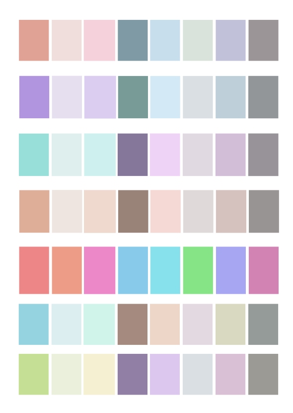
Alternative Colourways
Posted: April 12, 2016 Filed under: Field ADZ6888 Leave a commentI had a mini tutorial with Helen today to discuss my alternative colourways. I was worried that the palettes were too similar. We discussed that it was good that my alternative colourways showed similar tones to my original palette, so where there were lighter shades in my original, there were also light shades in my alternatives. We discussed how some of the colours in my original palette were cool whilst others were warm but that this wasn’t being reflected in my alternatives. There was nothing wrong with my alternative colour palettes (the first attempts or the second) but if i wasn’t happy I could revisit them if I had time.
At the moment I am waiting for samples from Bags of Love to come back so I have a little bit of time, so thought I would revisit the colourways and see what I could do to improve them.
I made a few different palettes and will choose which ones I prefer. Helen and I discussed combining the colours from my alternative palettes to create a palette which showed more colour variation and also cool and warm colour variation. I played with moving about some colours, which can be seen in line 2 and 3 below. I decided to leave the 4th line as it was as I like that it is a neutral palette. For the 5th line I have altered the original bright alternative colour palette to tone the brightness down a little bit as I wasn’t happy with it in the beginning – i’m still not sure, i will play around with some designs and see if it will be included. For the 6th and 7th line I have taken my original colour palette and altered the hue of the colours. I like these very much! They have a variant range of colours including cold, warm and neutral tones.
